24 Oct 2016


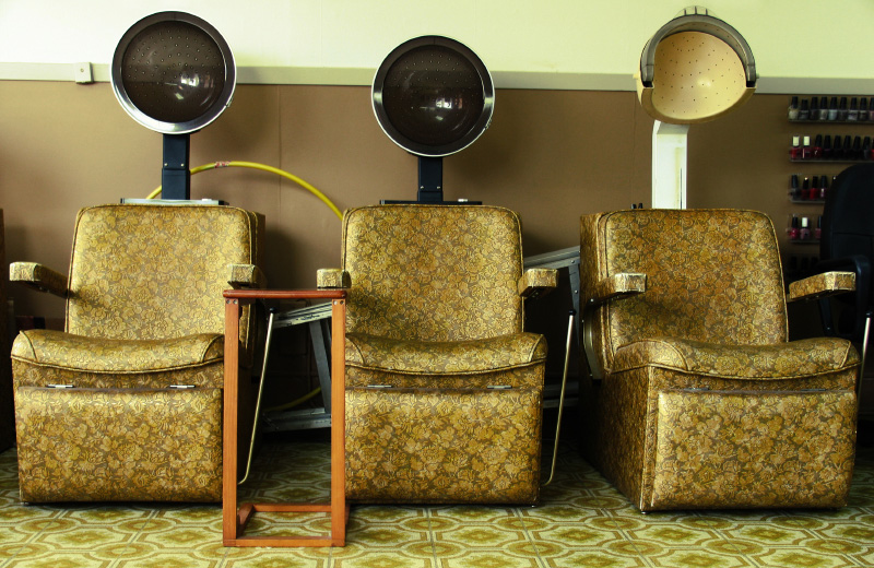
Turner Ink is on the move. Not far. Same building different floor. But an office move is always a good opportunity to have a bit of a clear out. This never happens of course because I’m a total hoarder. The upside of being a hoarder is that the stuff you hang on to for a ridiculous amount of time eventually becomes interesting from a historical point of view mildly entertaining to anyone who’s older than a millennial.
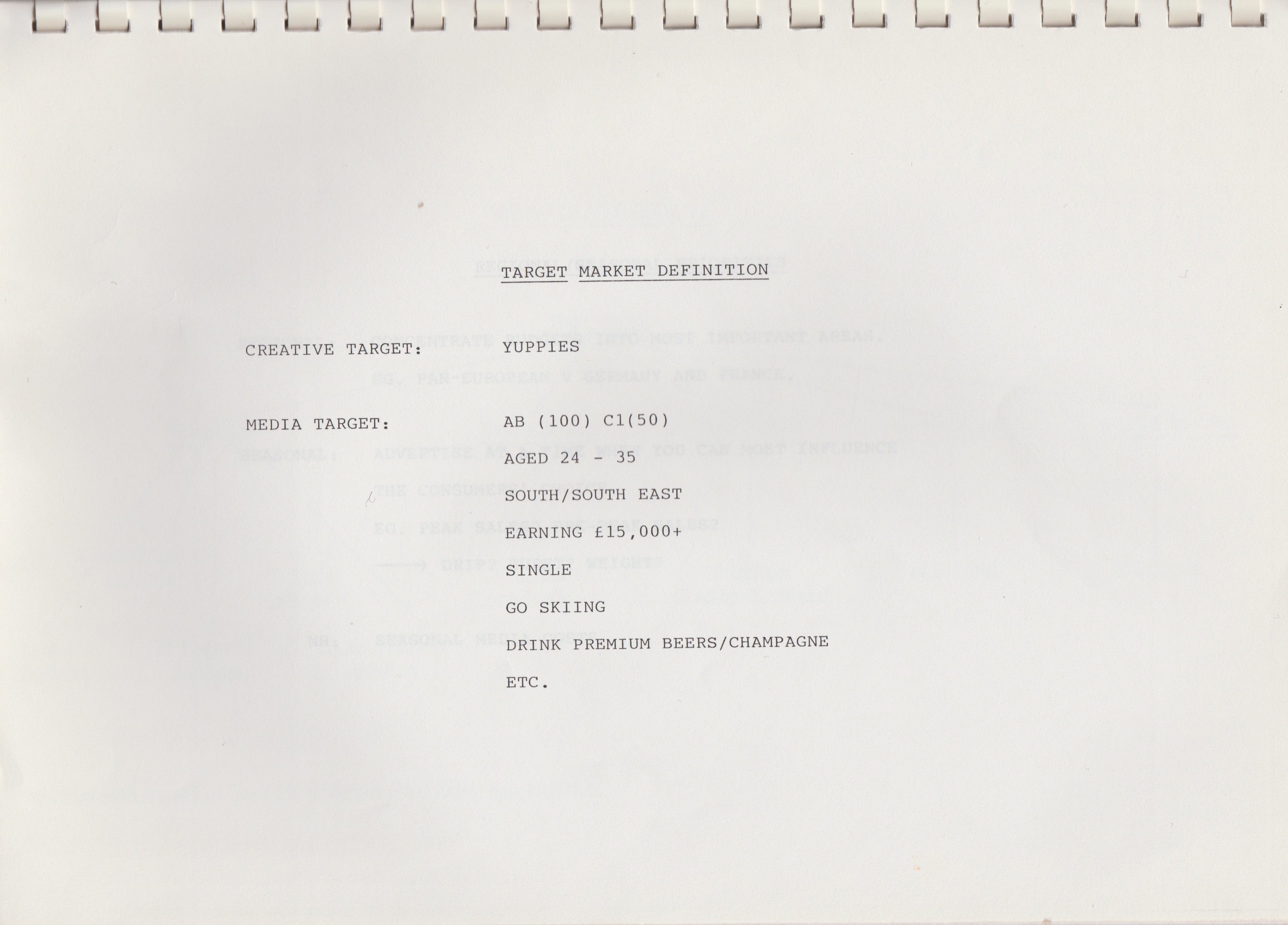
These are some of the treasures I’ve found in the tidy up. Back in the day I used to work in the NatWest advertising department. My only recollection of this time are those bloody ceramic piggies, the pinball wizard ad and the outrageous J Walter Thompson and Leo Burnett parties. I also used to work with Foote Cone and Belding (FCB) on the international banking account and this is an FCB media plan from 1987. Check out the plastic wiro-binding, the lack of branding and images, the reference to yuppies and the salary of £15k. (The average house price was £44k. They were the days.)
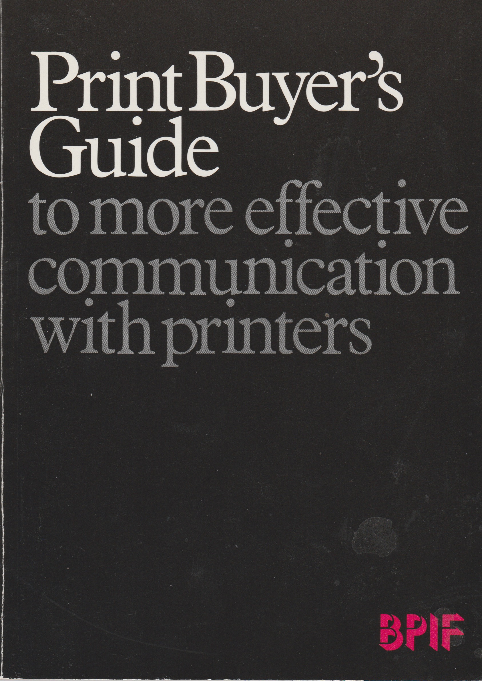
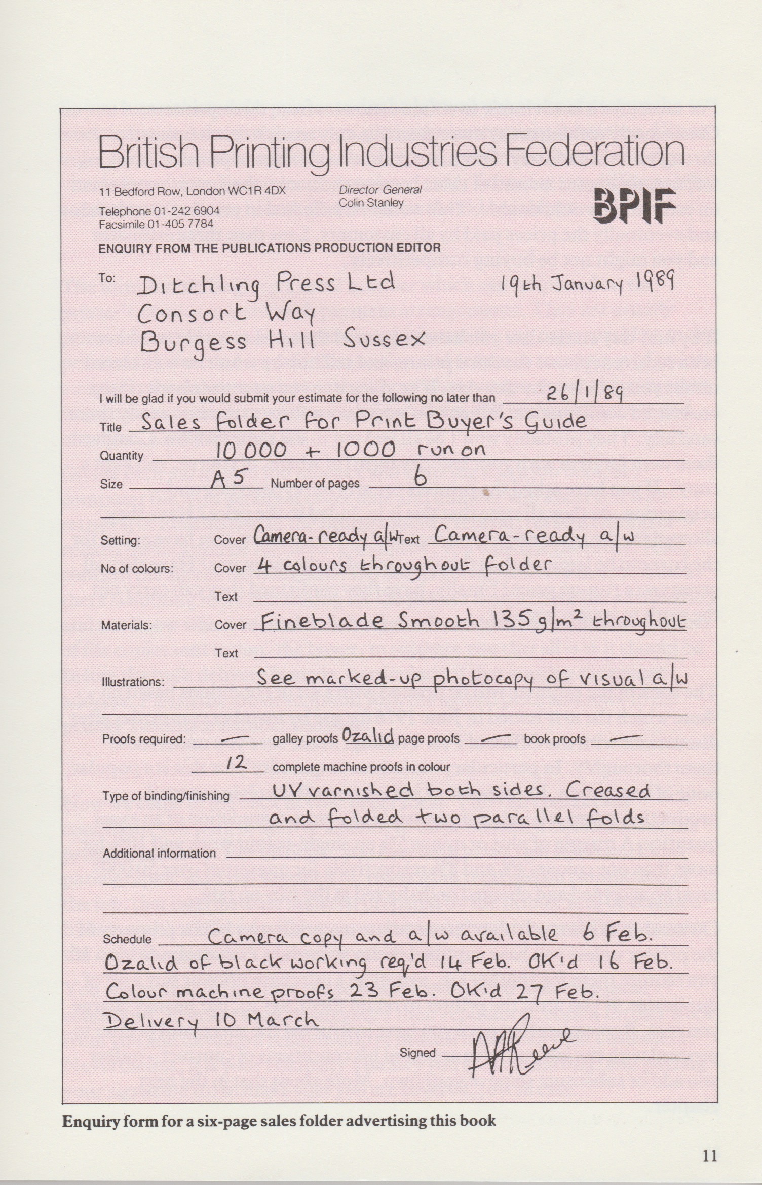
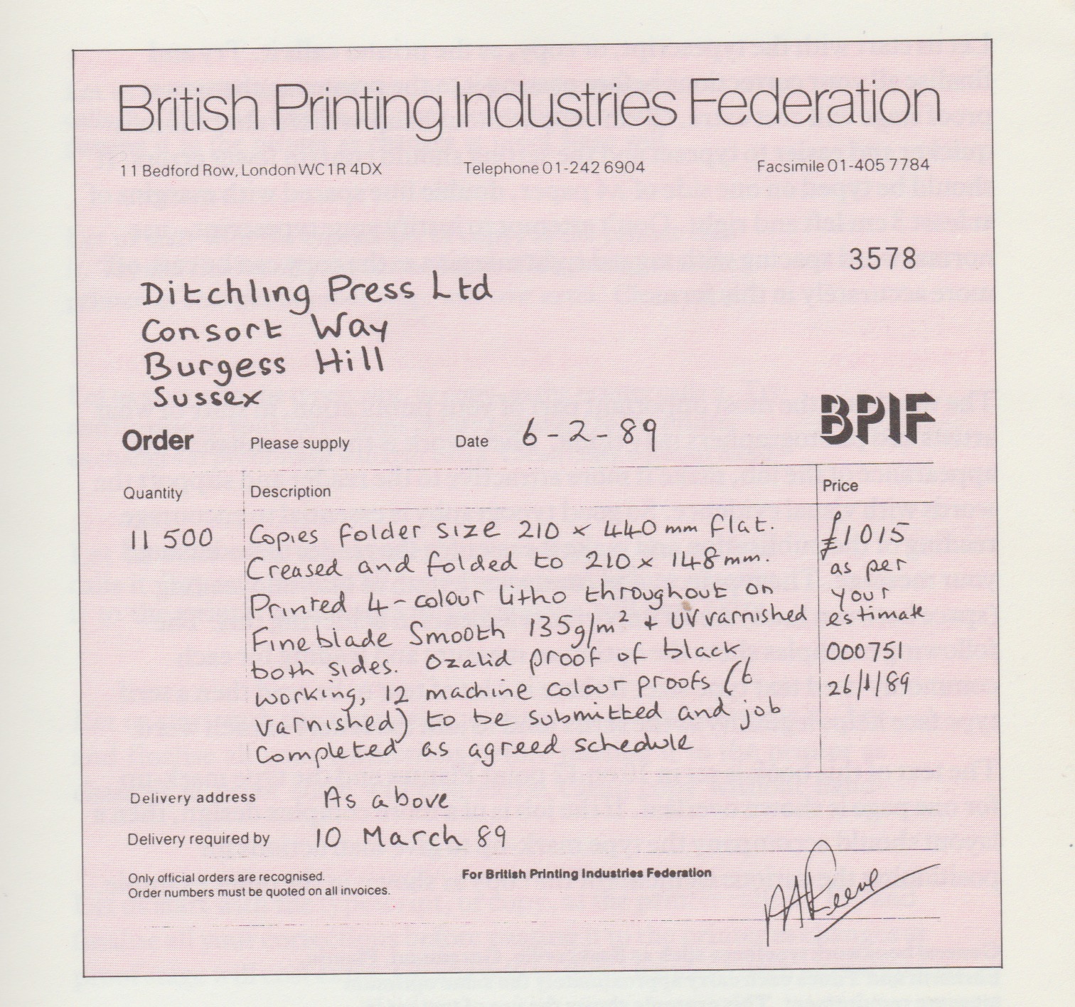
Next up on my stagger down memory Lane is my Print Buyer’s Guide from 1989. If you worked in an agency or client side and you bought print, this was your bible. Here’s an example of a print enquiry and a print order form. Camera ready artwork, ozalids and varnished colour proofs are no longer around. But 4 colour litho, UV varnishing and Finebalde paper still is. Look at the lead times: Artwork by February 6 and delivery by March 10. Not ‘tomorrow’ like it is now.
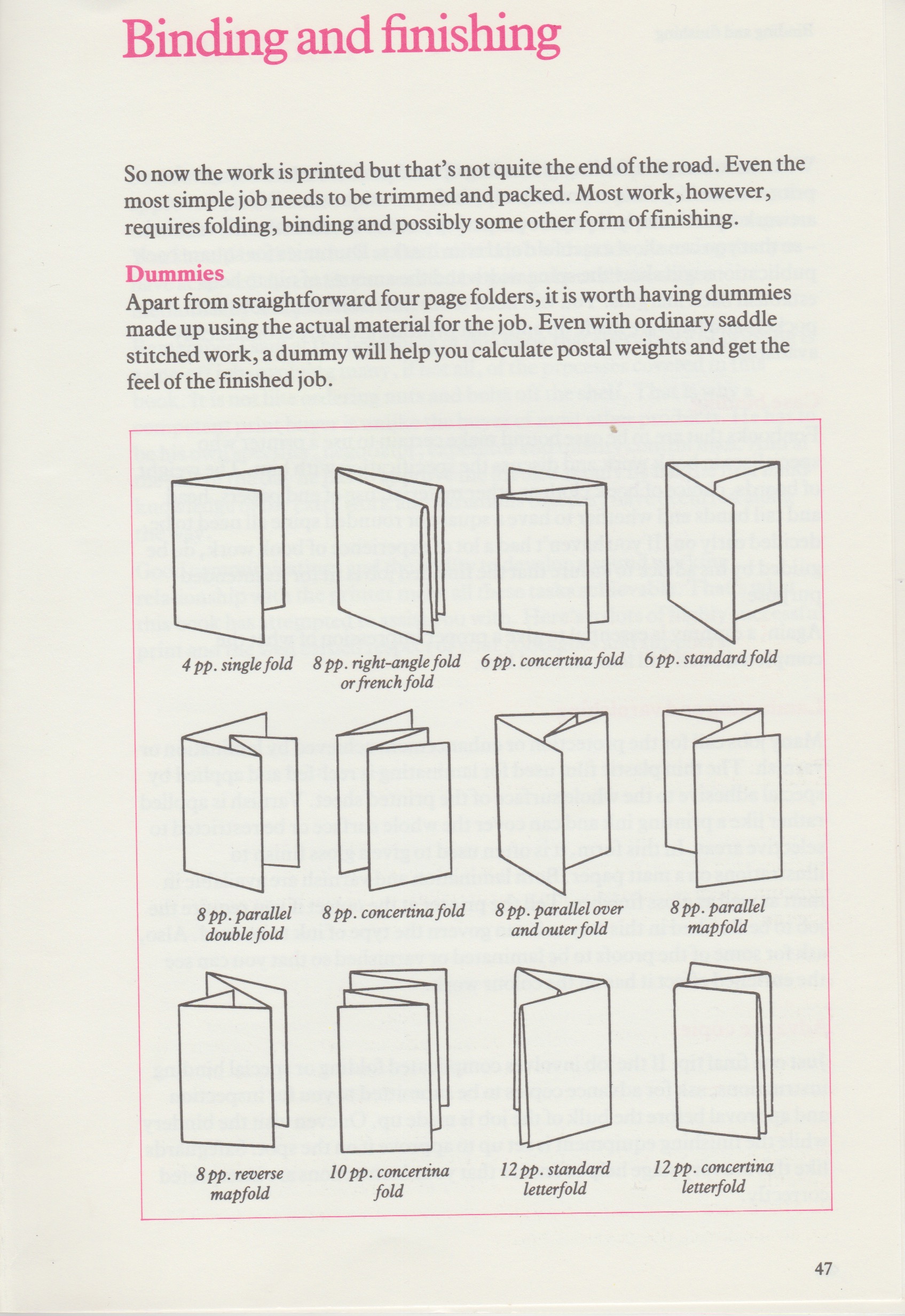
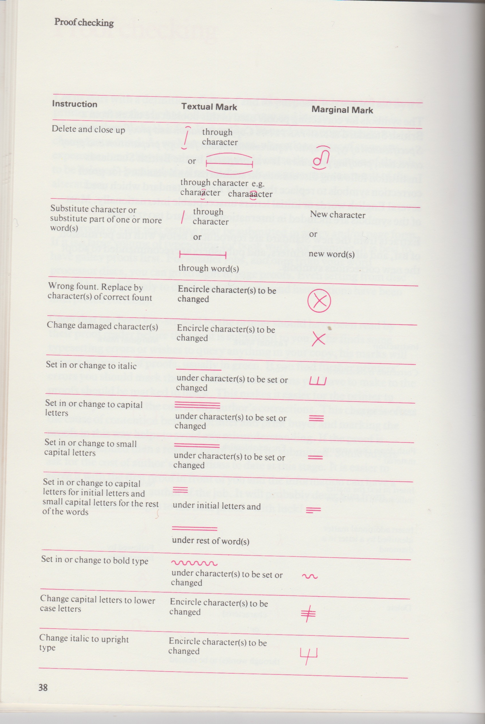
The book also included a page about different folds. I still send this to clients when we’re trying to establish how many printed pages (pp) there are. And it also has a guide to proofreading. So I’d get a wet proof sent from the printers and mark any amends straight on to the proof using these specific marks. None of this circling malarkey and scribbling in the margin. If you made a correction which you then wanted ignored, you wrote ‘stet’. Try writing stet on something these days. It’s like you’ve written a foreign language.
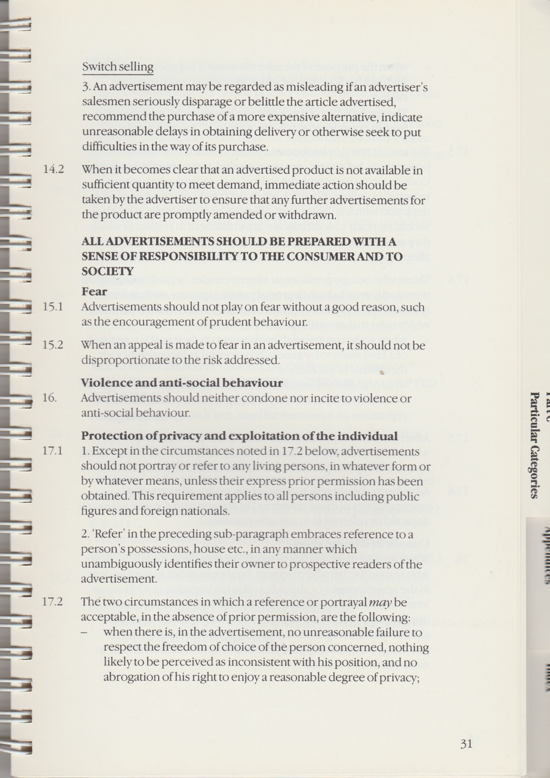
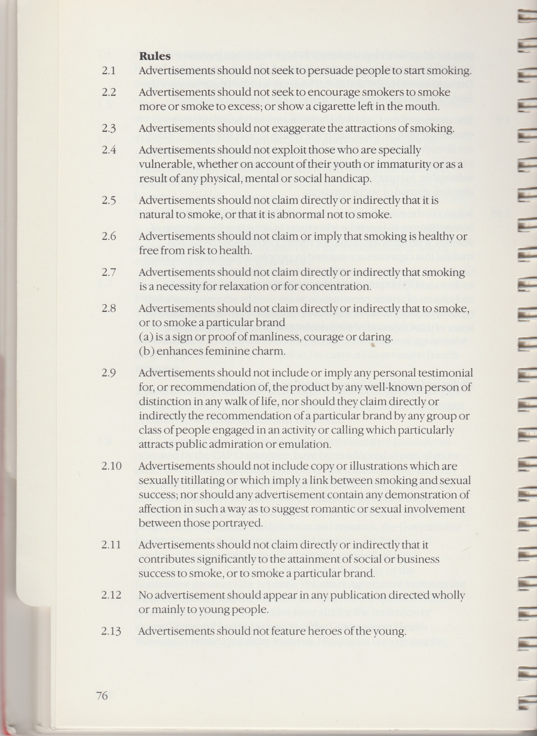
Something I also referred to a lot in 1989 was the British Code of Advertising Practice which covered press ads, all printed materials and indoor and outdoor posters. (Not radio or TV though.) I particularly like the headline ALL ADVERTISMENTS SHOULD BE PREPARED WITH A SENSE OF RESPONSIBILTY TO THE CONSUMER AND TO SOCIETY. Was just thinking about some of the atrocious ads we see today. And the whole section about advertising fags. ‘Advertisements should not include copy or illustrations which are sexually titillating…’ Now that’s a brief.
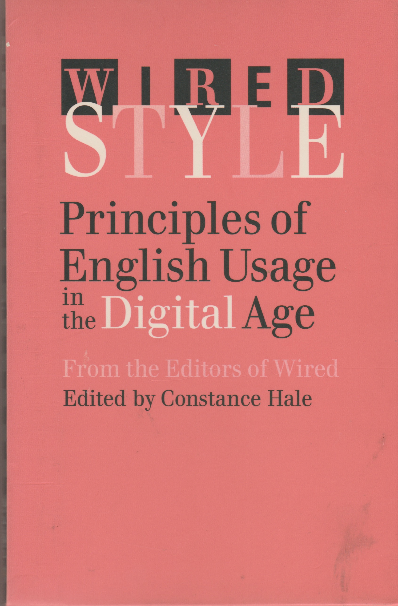
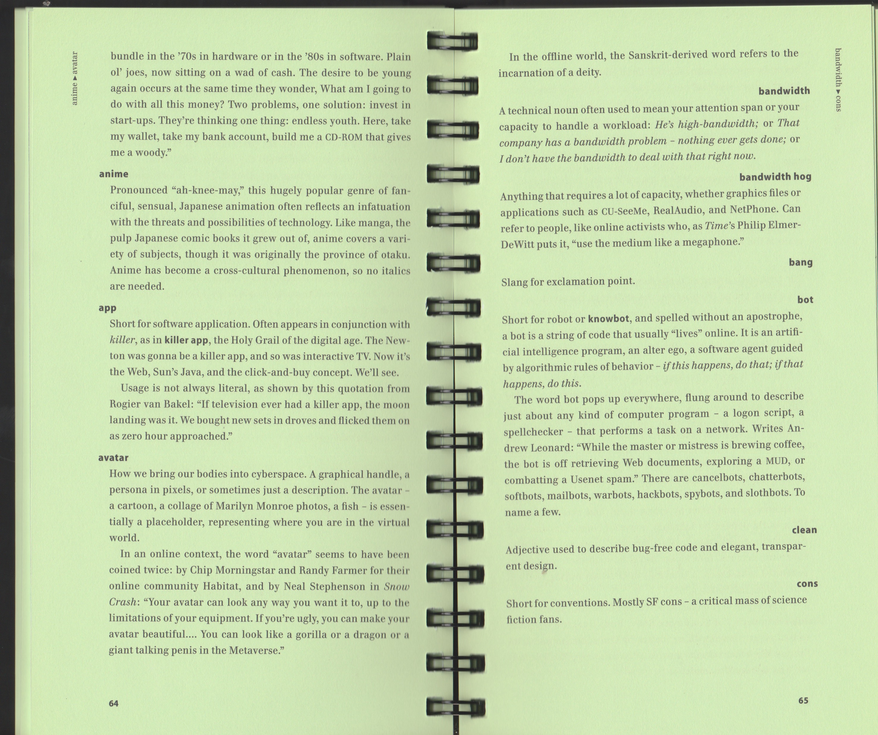
And to finish up, here’s something that’s a bit more recent. Well, 1996. Wired Style: Principles of English Usage in the Digital Age. This is a great little book, not least because it has bright green pages. I’d forgotten that Avatar was a Sanskrit word. And if for any reason you didn’t know how to pronounce anime, now you do.
This last page is interesting though for two reasons: the definition of a search engine as the ‘world’s equivalent of a librarian at the public library’ is brilliant.
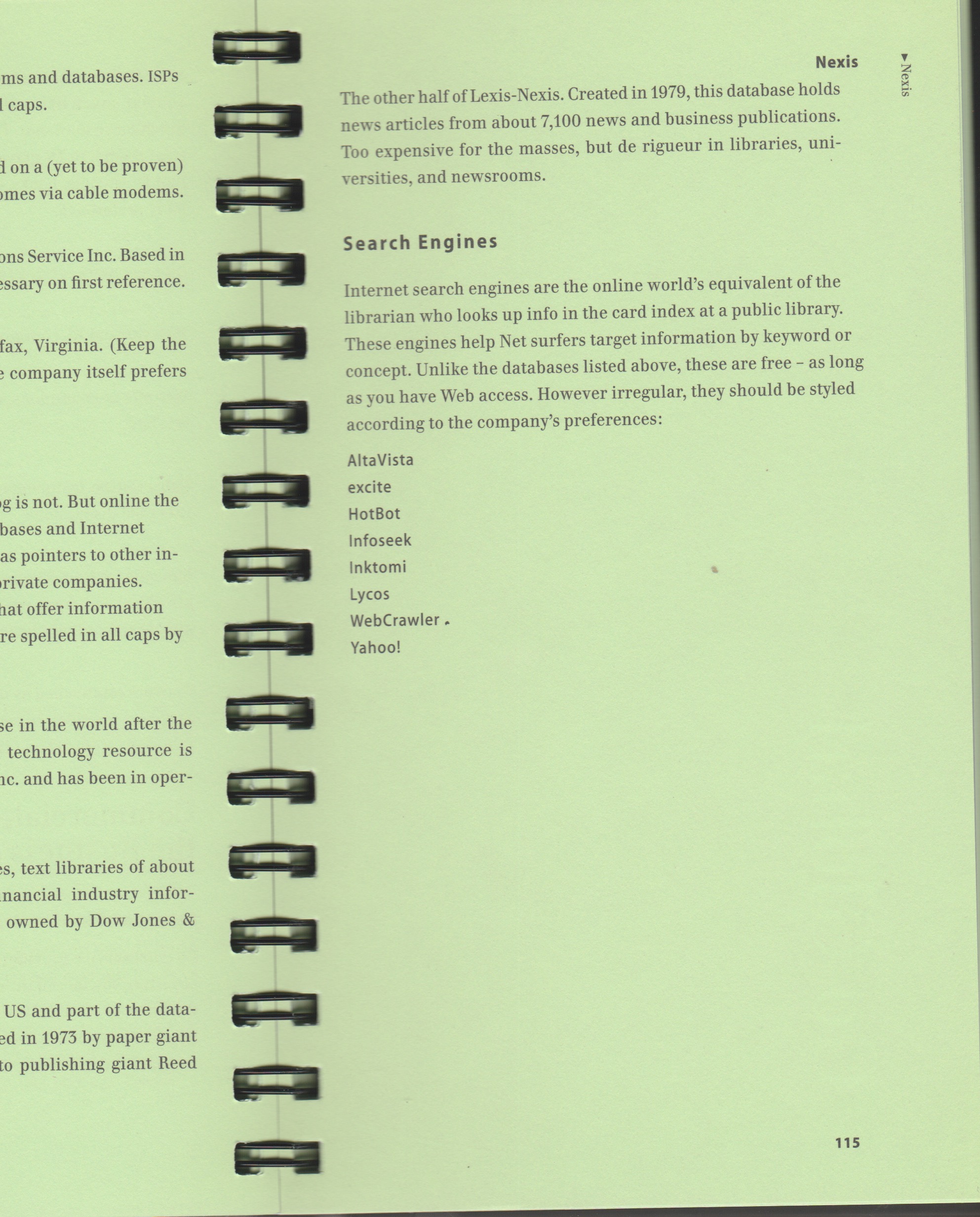
And the list of search engines. Remember AltaVista and Lycos? But what company isn’t there? Yep, Google. They didn’t get going until 1998.
No Comments